 I’ve shared tools like MultipleIE, which allow you to see how how your webpages are being rendered in different versions of IE,to maintain cross browser compatibility.There’s also another aspect of designing webpages ie., how your webpages look on different display resolutions.
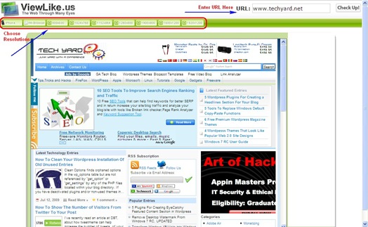
Check how your webpage looks on different resolutions at ViewLike.us,Just enter the URL and choose a resolution of your choice and you can see how your webpage looks on higher resolution monitors.It supports the following resolutions
- iPhone
- Wii Browser
- 800 x 600
- 1024 x 768
- 1152 x 864
- 1280 x 800
- 1400 x 900
- 1600 x 1200
- 1290 x 1200
Some webpages automatically increase or decrease width based on the resolution of the monitor, and some dont’t.It looks good if the page stretches so that we can make use of the full screen and display more content to the users rather than white space surrounding the content.
Check your webpages at ViewLike.us


