Netizens are no longer limited to just desktops for access to information on the internet, Technology advancements have made devices like iPad, iPhone, Galaxy Tabs, etc., as a easier way to access the internet.This wide range of devices have made it difficult and also important for web designers to make web designs which suite all the devices which can help the visitors access the information on even smaller devices easily by showing alternate design based on the device from which the request has been made.
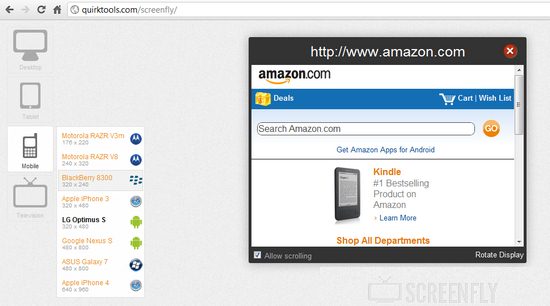
To test your site in such a scenario, we can use emulators but here’s ScreenFly a easier alternative to test how your site looks across various devices right from a web browser.Screenfly first asks for the URL of the website that you want to test and next after it loads for the desktop.
 Here’s the list of devices of which you can emulate in the web browser, which are categorized into Desktop, Tablets, Mobile and Television
Desktop : 10”, 12”, 13”, 15” NetBooks and 19”, 20”, 22”,23”,24” Desktop Sizes
Tablets :
- ViewSonic View Pad
- Velocity Cruz
- Samsung Galaxy
- Apple iPad 1 and 2
- Motorola Xoom
Mobile :
- Motorola RAZR V3m
- Motorola RAZR V8
- BlackBerry 8300
- Apple iPhone 3
- LG Optimus S
- Google Nexus S
- Asus Galaxy 7
- Apple iPhone 4
Television :
- 480p Television
- 720p Television
- 1080p Television
Also CheckOut :
To check how your site looks follow these steps :
- Enter the URL in the box and Click GO
- Next, once the page is loaded you can switch to different view to emulate different device resolutions from the menu on the left.
Checkout this video :


